Posted on

Meeting in the Wood – Oil Painting

Meeting in the wood oil painting by Simon Strawbridge

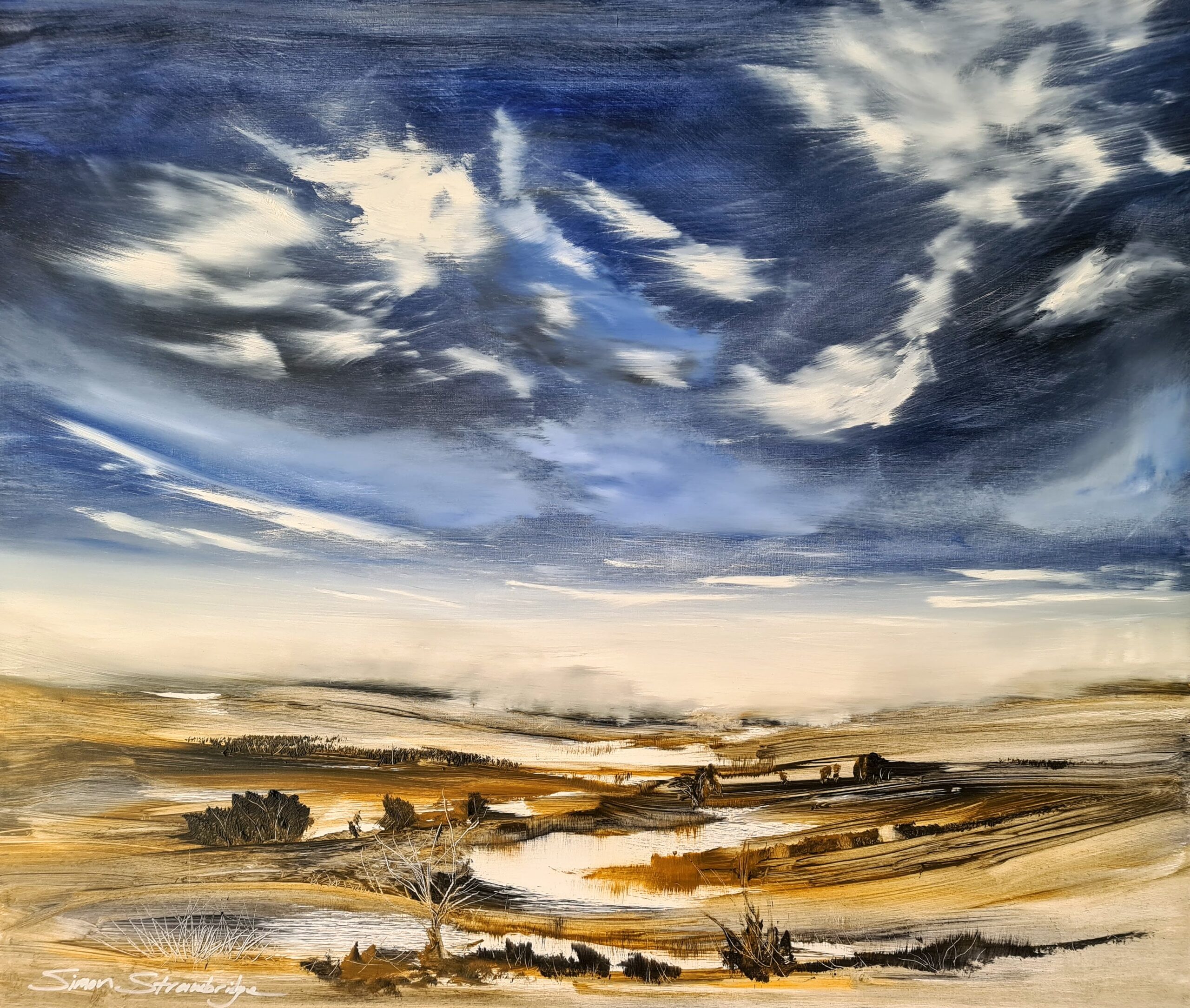
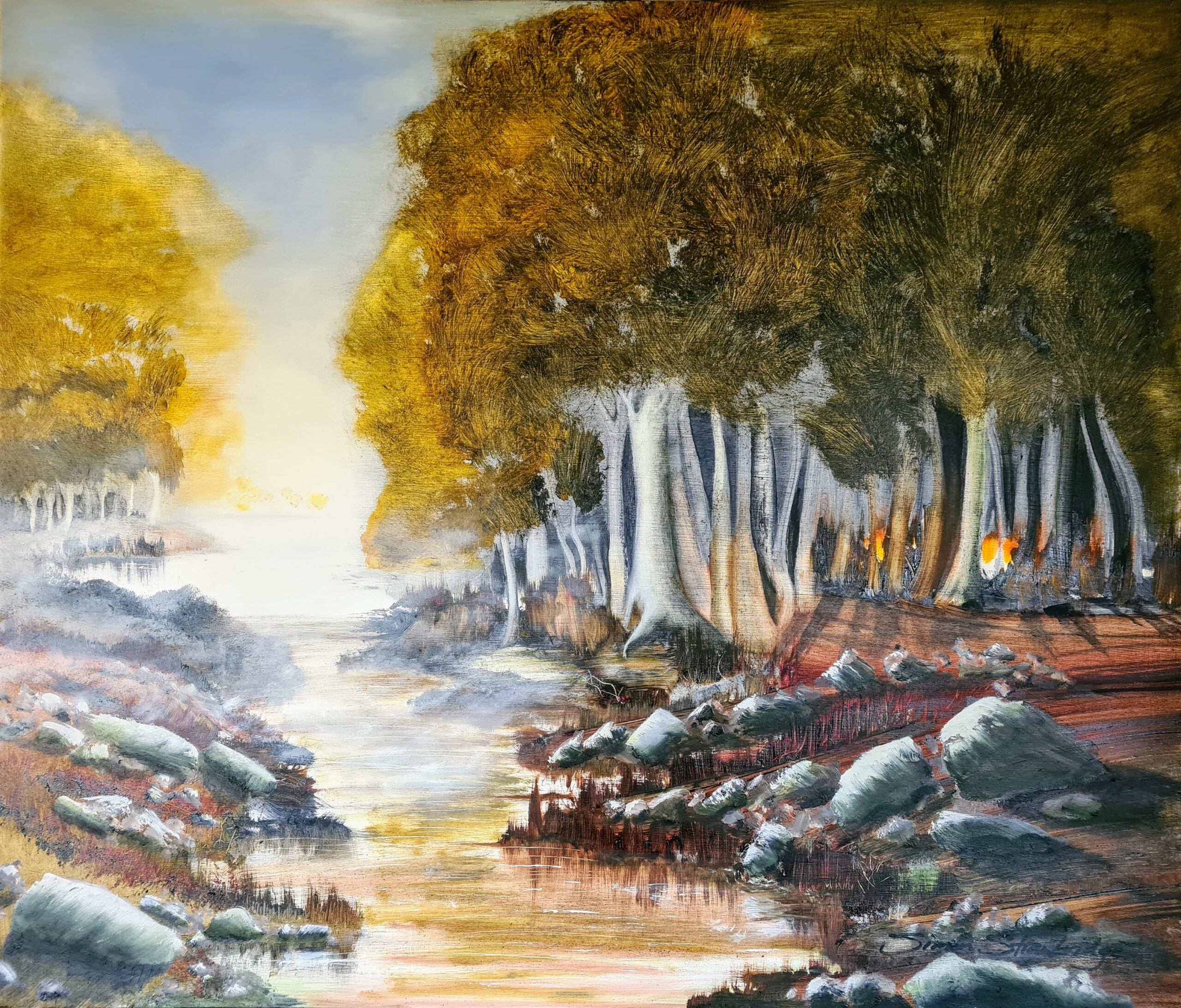
The key focus for this one was the massive light contrast over the water mid left. I knew I wanted trees and that patch of bright light.

I chose my palette from some well known favourites that I am often drawn to. Payne’s Grey, Indian Yellow, Yellow ochre, Red Ochre, Titanium White and Cobalt Blue.

As the painting developed and I used various brushes to achieve textures I wanted, I responded to what I thought were figures within the trees. Up until that point there was a large white patch of my base Gesso still showing at the foot of the trees. I added some Indian yellow and Red Ochre to this and continued with some Red Ochre on the trunks of trees where I thought red fire light may catch.

There were several moments where I thought the painting was simply going to fail, but my new friendship and confidence with oils helped me push through.

Happy with the result!

Simon

Posted on

Silent River Sunset – Oil Painting

Silent River Sunset - Oil Painting by Simon Strawbrdge

I found this piece tricky for a number of reasons. The contrast I set up between some tonally similar areas just wasn’t looking right. Made some amendments (thank you oil!).

The sky evolved in such a lovely way. At one point my plan failed. I decided to change it before some paint had dried enough and created a horrid looking green sky in places. Scraped off what I could and went bold with Alizarin Crimson, Magenta and Indian Yellow.

The way the dark patches of horizon melt away into misty distant fog. Cheeky perspective trickery using swift blending of over heavy additions of titanium near the ‘original’ sharp horizon. I always knew it was going to get blurred! A great and satisfying technique taught to me by Stuart Davies.

It was so satisfying bringing the water to life. Looking forward to water in more paintings in the future.

The larger tree in the foreground came together well. Enjoyed creating the illusion of white textured bark with a blush from the sky.

I’m hoping the whole piece gives a calm sense of the silent end to a day.

29.5 x 25 inches – Tripple Gesso 18mm industrial staging plywood.

Payne’s grey, Burnt Sienna, Alizarin Crimson, Red Ochre, Indian Yellow and Titanium White.

Liquin Original added in varying quantities.

Posted on

Approaching Black Loch – Oil Painting

Approaching Black Loch - Ghost Tree Focus

I’m growing to love the feel of Indian yellow. It’s so warm and changes in helpful and earthy ways when you add a little yellow ochre and Payne’s grey in varying measures.

The colour of the loch remained very pasty and washed out for a lot of the build phase. It looked far away and super light like the distant day I wanted it to be the other side of the glen. I ended up getting very bored with it! Chucked on some French ultramarine and added a significant amount of Payne’s grey. Waited, then added titanium white carefully to create the waves, trying to follow the rules of perspective as best I could with a 00 brush and the edge of a palette knife.

I had a lot of fun creating the ghostly tree. It didn’t exist until the last 10% of creation. In it’s place was an expanse of reasonably plain grassland.

Rocks of varying shapes and sizes appear all over the place. I’m starting to enjoy painting rocks. The shadows, the cracks and the chaos certainly add some interest for the viewer and the creator!

See you soon with the next one!

Take care,

Simon

29.5″ x 25″

Posted on

Red Dunes to Azura – Oil Painting

Red Dunes to Azura

I’ve not had a tube of red ochre for long. It made a big appearance in this one! Along with the Pthalo Turquoise, it really deviates from the more controlled and subdued palette of the other oil paintings so far. I like lots about it and had a lot of fun but my favourite spots are the little light patches of the river water. I also love the way the trees form a good illusion of depth and form. Scratching stick had fun!

I’m going to come back to this article and explain the change of colour for the dunes. They started off light white/pale yellow. They started to annoy me, so out came the Red Ochre…

29.5″ x 25″

Posted on

Through the Marsh – Oil Painting

Through the Marsh - Oil Painting by Simon Strawbridge

I really like what I managed to achieve with a big brush here. For this technique it’s all about loading up the brush and going for it but pausing and waiting to spot some areas of texture and colour that you simply cannot touch again. That happened lots in this painting and felt great!

Bringing the white of the sky down and dragging it around in the horizon really helped create a moody, rainy mist like perspective.

Payne’s Grey, Yellow ochre, Titanium White, French Ultramarine, Cobalt blue, Liquin, big brushes and a small scratching stick!

29.5″ x 25″

Posted on

Harvest Fields and Big Sky – Oil Painting

Harvest fields and Big Sky - Oil Painting by Simon Strawbridge

My first oil painting! Thanks in no small part to the online encouragement of Stuart Davies who gave me the nudge I needed. I love his “Just get on with it and don’t worry” approach. Find him via his website (stuartdaviesfineart.com) and his YouTube channel (Stuart Davies on YouTube). I’ll mention other art heroes in separate posts. In the context of this first oil painting, Stuart gave me the push I needed.

I’ve been fearful of oil painting for years. Messy, toxic, lengthy process and drying. It’s actually lovely when you’ve had some good advice and truly relax into it.

For this one, I loaded up the pallet with sap green, yellow ochre, Payne’s grey, burnt Sienna and a little Indian yellow all for the land. Titanium white, French Ultramarine, Cobalt, burnt Sienna and Payne’s Grey for the sky. Add as much Alkyd/Liquin as you need. Quite wet.

Wiping off with tissue and leaving as many of the brush textures as you need is key for this technique. A lot of fun, but have to make sure that you set up some light tonal areas so you can use them to show off your rich darks (in my case mainly trees).

The sky was created using a classic Stuart Davies’s approach. Really enjoyable and effective.

29.5″ x 25″